Personal Project
UI Design
To push my design boundaries and refine my UI skills, I embarked on a self-directed project creating several mobile app and web page prototypes using Figma. This exploration focused on crafting user-centered interfaces, incorporating various design principles like typography, color palettes, and interactive elements.


Music App
Streamlined User Interface: The design prioritizes a clean and user-friendly layout, allowing users to easily navigate through music libraries and playback controls, even in low-light conditions.
Night Mode: The app offers a night mode option, switching the color scheme to a darker palette for better eye comfort during nighttime use.
Centralized Music Player: A prominent music player bar at the bottom of the screen provides quick access to play/pause, track skip/rewind, and volume controls.
Easy Song Browsing: Scrollable menus categorized by genre, artist, or playlist offer various ways to explore music.
Current Track Information: The music player displays the album art, song title, and artist information for the current track.
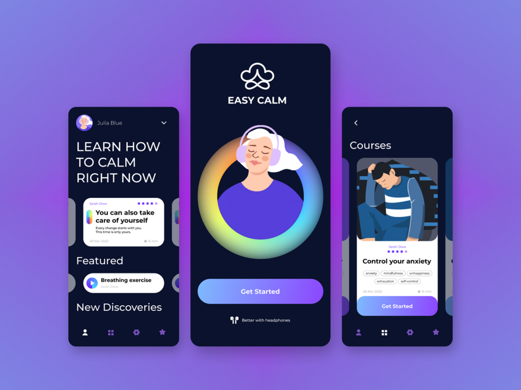
Easy Calm: A Calming Oasis in Your Pocket
Calming Color Palette: The interface uses calming colors, like soft blues and greens, to create tranquility and reduce anxiety upon opening the app.
Centralized Action Area: The “Learn How to Calm Right Now” section uses hierarchy and contrasting colors or larger text to highlight stress reduction tools, prioritizing easy access in moments of crisis.
Categorized Course Library: The course library uses icons or labels like “anxiety mindfulness” and “unhappiness” to help users find long-term stress management programs easily.
Intuitive Button Design: The “Breathing Exercise” button uses clear, concise language and intuitive design for easy access to this stress-reduction technique.


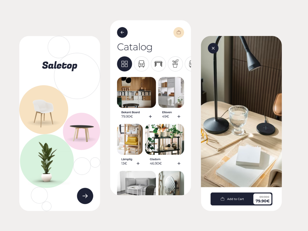
Saletop Furniture Catalog App
Appealing Navigation: Large, high-quality category previews showcase furniture styles, grabbing user attention and simplifying navigation through the app.
Minimalist Product Cards: Clean layouts featuring product names and prices keep the interface clutter-free. This allows users to easily identify and compare products without information overload.
Clear & Actionable buttons: A contrasting color and larger size make the “Add to Cart” button stand out, guiding user actions and streamlining the purchase process.
Layered Information for Usability: Subtle hover effects reveal additional product details on user interaction. This balances a clean aesthetic by providing users with essential information.
Modern Typography for Readability: A modern typeface complements the minimalist design and promotes clear communication, enhancing readability and reinforcing the Saletop brand identity.
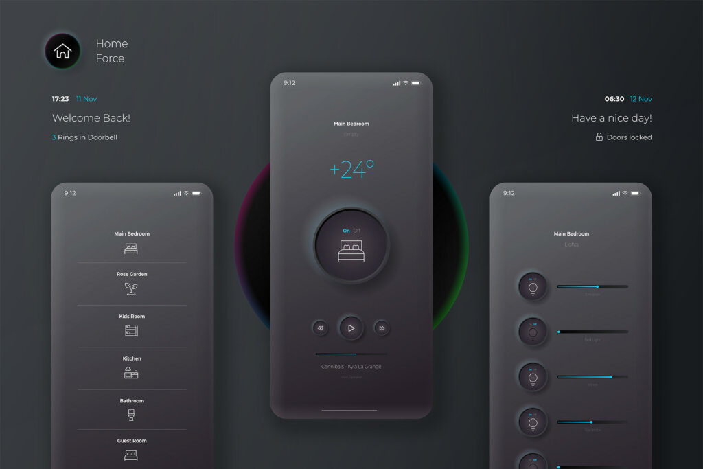
Home Force: Neumorphism for your home
Neumorphism Style: The app uses neumorphic design with soft shadows and highlights for a realistic, modern look. This enhances visual appeal and usability.
Interactive Elements: Subtle 3D effects on buttons and icons provide clear visual cues, improving interaction.
Minimalist Layout: A clean, uncluttered layout focuses on essential elements, making the app intuitive and reducing cognitive load.
Consistent Iconography: Recognizable icons enhance navigation and user efficiency.
Soft Color Scheme: Muted colors complement the neumorphic style, creating a calming and user-friendly environment.


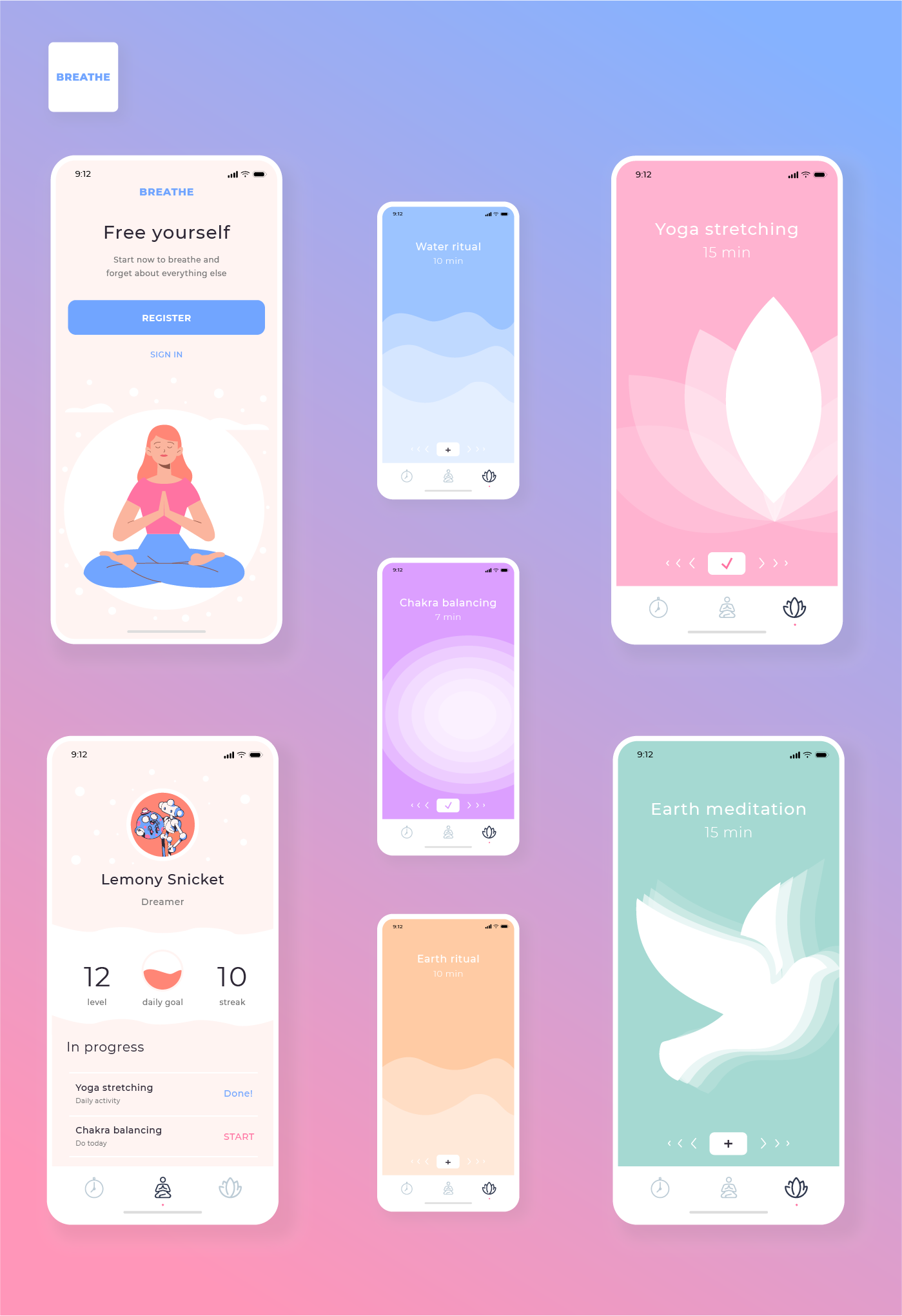
BREATHE mobile-app
Calming Color Palette: The app uses soft blues and greens to evoke tranquility. This choice is grounded in color psychology, where cool colors help reduce stress and create a peaceful user experience.
Intuitive Navigation: The interface employs a clear hierarchy with a tabbed layout, ensuring users can easily find different meditation practices. This approach enhances usability by reducing cognitive load.
Visual Previews: High-quality images and icons provide a glimpse of each meditation session. This technique increases user engagement and makes the selection process more intuitive.
Minimalist Design: Information cards with clear titles and durations maintain a clutter-free interface. This minimalist approach ensures essential information is easily accessible, improving user focus.
Interactive Feedback: Subtle hover effects and animations offer interactive feedback, revealing additional details about sessions. This design choice balances simplicity with functionality, enhancing the overall user experience.